To welcome the season of flowers, we would like to introduce 8 colours from 513 Paint Shop that the paints are named after plants. Two collections, Voyage and La Peinture, are included. Let's have a look and get some inspirations for the interior design of your home!
The Voyage Collection
Voyage is a French word that means journey and travel. With this special collection, you can explore the world and capture your travel memories to inspire a new interior palette for your home.
105 Sakura - a time of renewal and optimism 

As suggested by this colour’s name, 105 Sakura resembles the flower, Sakura. It is the national flower of Japan. The pops of pink mark the ending of winter and signify the beginning of spring. 105 Sakura can bring a romantic and tender effect in any place. Complemented with shades of green like 317 Mint and 320 Forest, it makes a fabulous combo for your home.
111 Cardamom - grains of paradise


111 Cardamom is a darker shade of yellow-green. Green cardamom is often used in traditional Indian sweets and in masala chai (spiced tea). Both are also often used as a garnish in basmati rice and other dishes. Individual seeds are sometimes chewed and used in much the same way as chewing gum. 111 Cardamom can give your house a more vivid image when matched with actual greeneries and plants.
115 Eucalyptus - strength, protection, and abundance


115 Eucalyptus is a greyish shade of green that is named after the plant, Eucalyptus. Australian Aboriginals practiced burning eucalyptus leaves to purify and negate negative energy and saw eucalyptus as a sacred plant. 115 Eucalyptus is a calming colour that can create a relaxing atmosphere to your household. It can be matched with Basic White to make a perfect combination.
117 Elderflower - endings and rebirth
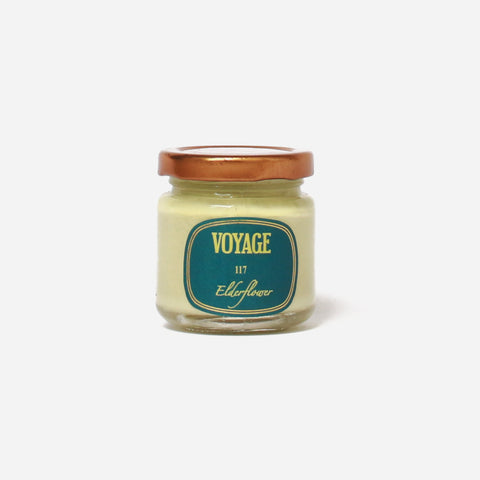

The name of this colour, 117 Elderflower, bears a resemblance to the actual elderflower, which is a sacred tree across Northern Europe and the Druids regarded it as a gift from Mother Nature who lived within it. 117 Elderflower is a shade of yellow-green that adds a sense of tranquillity to spring. The colour goes well with wooden furniture to set a calm and peaceful tone.
The La Peinture Collection
La Peinture, which simply means paint or painting in French, is our first artisan collection of environmental interior paint.
518 Huile d' olive - the divine presence


518 Huile d’ Olive is a soft and sacred brown yellow that of olive oil, the main element which is used for sacraments of baptism. 518 Huile d’ Olive’s sacredness resonates with sunlight, and is amplified, giving a warm and bright interior. Additionally, 518 Huile d’ Olive as a muted pastel pairs well with contrasting colours 517 Figue or 523 Violet Candy.
521 Bois de Rose - elegance and royalty


521 Bois de Rose is a muted pastel that shows a depth of colour. The depth of colour for 521 Bois de Rose emanates an elegant and luxurious mood, creating an inviting look for interiors. Adding to its nobleness, 521 Bois de Rose represents silence and serenity, it charmingly calms its surroundings, bringing you a peaceful and undisturbed atmosphere. 521 Bois de Rose is one of the best choices when pursuing a quiet and peaceful atmosphere.
522 Camomille - purity, peace, enlightenment, poise, and calmness


522 Camomile is a mix of yellow and subtle light brown colour that gives off a feeling of delicacy. It is widely consumed as tea, with a mild and slightly sweet taste. The timidness of 522 Camomile makes it an ideal colour for living rooms and bedrooms as it brings an atmosphere of peacefulness and quietness, creating a relaxing room best for resting.
536 Sage Tea - wisdom and immortality


536 Sage Tea is another muted colour of whitish grey. Sage has been consumed for getting rid of negative energy, and restoring harmony to its surroundings. The ability of refreshing its environments are carried into 536 Sage Tea, making 536 Sage Tea one of the best main colours for an interior that seeks harmony. Additionally, 536 Sage Tea also makes a good accent wall with 529 Gris Souris with its slight touch of calm.
Spring symbolises life, which is also a season of new beginnings and growth. Named after different plants, these colours bring a relaxing and refreshing atmosphere. There are more colours from the 5 Collection that add a touch of green to your space. Colours from 513 collections can be painted as the main colour or simply an accent wall for your home to be presented anew.
If you are interested in the colours above or even other preferred colours, do not hesitate to contact us, let us match and find the colours of your style! Email or call us for details.
Additionally, if there are any beloved colours you would like to promote, feel free to share it on our Designer Choice.
Our products are:
- Free and low in carcinogenic VOCs
- Non-toxic
- Children and pet-friendly
- Eco-friendly
Come visit our shop and explore brilliant colours for your home and interiors!
Leave a comment